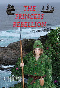
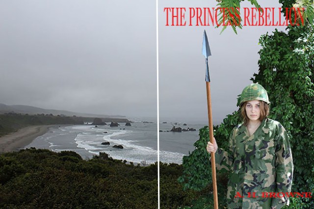
#1
Okay, I did some mock-ups of the first of the background photos I took, with our princess in front of them. The white line in the center of each version is to remind us that the cover will be a wrap-around, and extend onto the back cover, so the place to the right of that line is our main work space.

#1-A
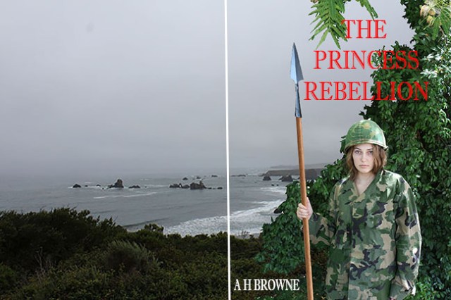
You may also notice that I took the trouble of flipping each background over, to see if it works better in one direction or the other. These are posted in pairs, with the flipped background being the ‘A’ version that follows the original background.
#2
I also used different fonts and colors of fonts, and played with the placement of the fonts. My main problem now is that I think that some of the foliage I left in the foreground picture obscures the title. A good gray sea or sky would make the title pop.
#2-A
Maybe I am overthinking this?
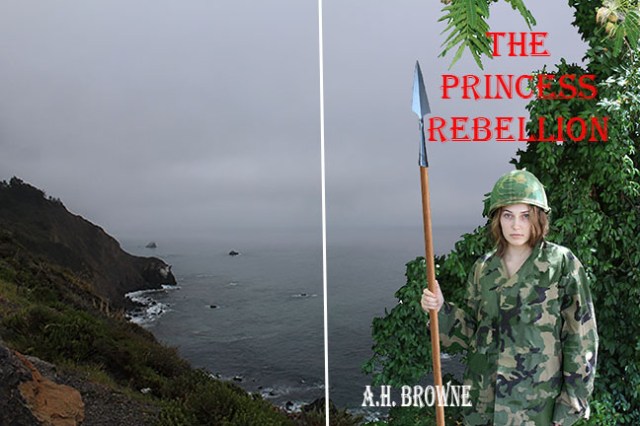
#3
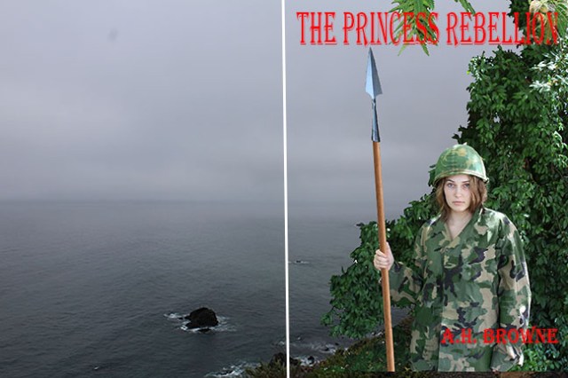
#3-A
Okay, I have more of these coming. I like the font in #1 best so far. All of these have some good points. The size and placement of the title and my name can be changed any way we want them. I can remove some more of the plants. Let me know what you think of these.