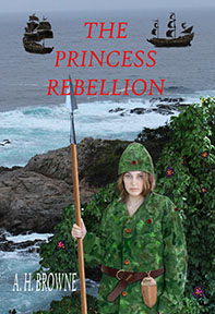
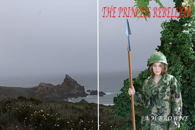
#4
Okay, I do love the font… but I need to trim those bushes back. Gray sky would be better to show off the text.
#4-A
Same background, but I reversed it, left to right. Remember, the pointy rock will be on the back cover of the book. I am still doing these in pairs, with the backgrounds facing opposite directions.
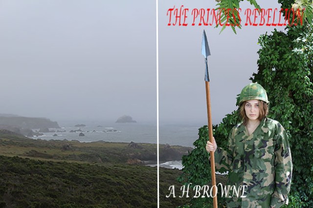
#5
Our princess looks a little too bright for the overcast sky, but I can fix that.
#5-A
Still playing with the font layout. Can’t decide whether to do it as one line or up and down stack.

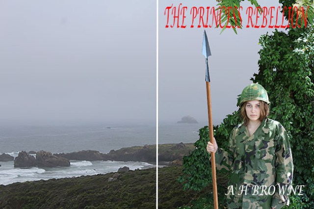
#6
Yeah, I need to do a quick version of the foreground with less foliage.

#6-A
Well, since we have ten backgrounds to pick from, I will do a quick and dirty foreground with less plants, and use that on our final mock-ups.