
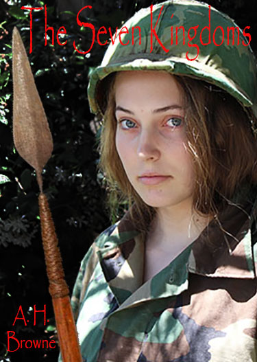
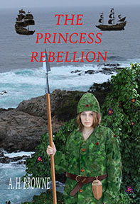
Well, this one has more princess, which I like. And I darkened up the foliage a little. Is that still too cluttered?
Well, this one has more princess, which I like. And I darkened up the foliage a little. Is that still too cluttered?

Hit this button!
Click it! Just do it!


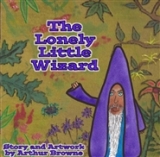
Click to go to book page with links

A book for kids... Click to go to book page with links
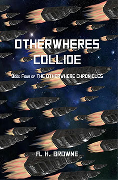
Otherwheres Collide-my newest book
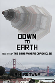
My latest novel
Pouring My Art Out by Arthur H. Browne is licensed under a Creative Commons Attribution-NonCommercial-NoDerivs 3.0 Unported License.Based on a work at https://pouringmyartout.wordpress.com/.

This work is licensed under a Creative Commons Attribution 3.0 Unported License.

Honestly, it would have helped if your daughter had a little more interesting facial expression for the cover. Right now she looks more like she’s just waiting for your photo session to be over. 🙂
She is leading friends into battle against an evil empire… how happy should she look. I will probably add dirt and maybe bloody scratches too, which will make the point more clear. I told her to make a war face.
I don’t think she should look happy. But this doesn’t look like a war face either. What if Molly is just too nice and kind to make a war face?
You may have a point.
Here’s my 2c without having looked at the others: Apply an artistic effect to the picture. Change your writing in that you place it on top of an overlay layer. Depending on how the colour comes out with the artistic effect you may have to change your writing’s color and font to make it pop more.
I will probably not put the title on top of the helmet when I do the actual cover. And I will make the font fatter. I really just need to pick a starting place from the photos I took,
I think the spear is better than its predecessors
Yeah, I do like that spear better. Technically, the other one has a better handle, where it fits over the spear shaft. There is one part of the book where soldiers use the spear blades as knives.
It’s not too cluttered exactly, but the writing is wrong. Whether the colour, font, position, no idea. But it’s wrong.
It is all changeable, once we pick the best layout. Thanks for the feedback. I am really just looking for the best starting position.