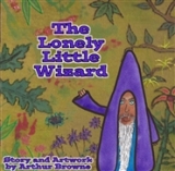
Many of you said that my original artwork for the back cover (shown below) was too… ‘busy’… ‘jolting’… well, you used a lot of different words to tell me it wasn’t my best work…
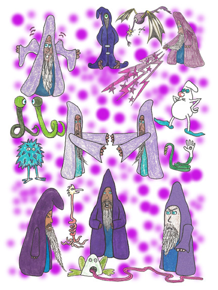 Okay, the thing is… and I could have kept this ‘thing’ to myself, and made you feel like I was getting better at taking your advice… but the thing… and the truth… is that my daughter, Jessica, who compiles and formats my books and sends them to the publisher… decided that, because of the fact that some of the art I did for the book was in a ‘landscape’ format, and some was in a ‘portrait’ format, we should go with a square shape for this book… and the new picture fits better.
That being said, she also agreed that the back page had too much going on.
So… see… I agreed with you… more or less.
Although I still think that first idea would have grabbed the attention of little kids…