
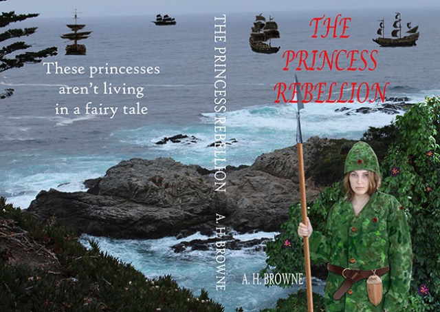
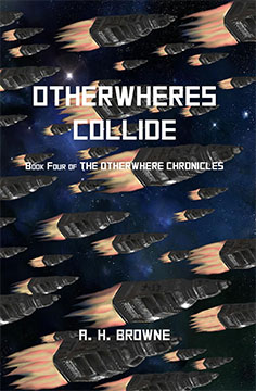
That is the full, wrap-around version, with the text for the cover, spine, and back cover. I know, some of you liked the title to be one line instead of stacked. But I did stick to two ships… on the front… and I thought they framed it better this way.
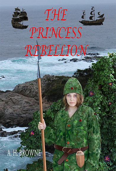
Here is just the front…
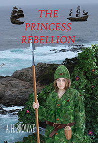
I took your advice for the most part. The flowers were too red, and vied with the patches on our princess’s uniform and the title. I made them more black and deep-purple. There were too many ships. The book is already at the self-publishing place, so sooner or later, I had to call this done, so I can order a first copy and start looking for issues both inside and out.
Thanks to everyone who gave me feedback!!!
Oh, and for a while, you can still read most of the novel for free, by clicking the words: The Seven Kingdoms… (which is what I was going to call it, until I remembered that that is a ‘Game Of Thrones’ thing)… up in my blog header. It is completely unedited, and you don’t get to read the ending. Ha!


Looks great!!
Thanks, man!
I love it. Oh man, though, I wish I had seen it before, because I’d tell you to leave a little more space on the spine below your name. Because libraries put their dewey decimal info there, and I know with mine, because I hadn’t left space, part of my name was covered up. Live and learn…
My daughter didn’t like the fonts, so I may have to do that over anyway. HA! Thanks for the input!
Great! Good luck!
yup