
Or: Help me design the cover of my new children’s book !
I am still in the process of showing you step by step how I am developing the cover art for my new children’s book. In the last post, I shared two of the earliest versions. And it turns out that people like the one that I didn’t add the dark ink outlines to. So this is sort of exciting, because I am getting feedback from you and using it to make the final decision on which version I use to do the cover.
I did some clean up and detail work last night…
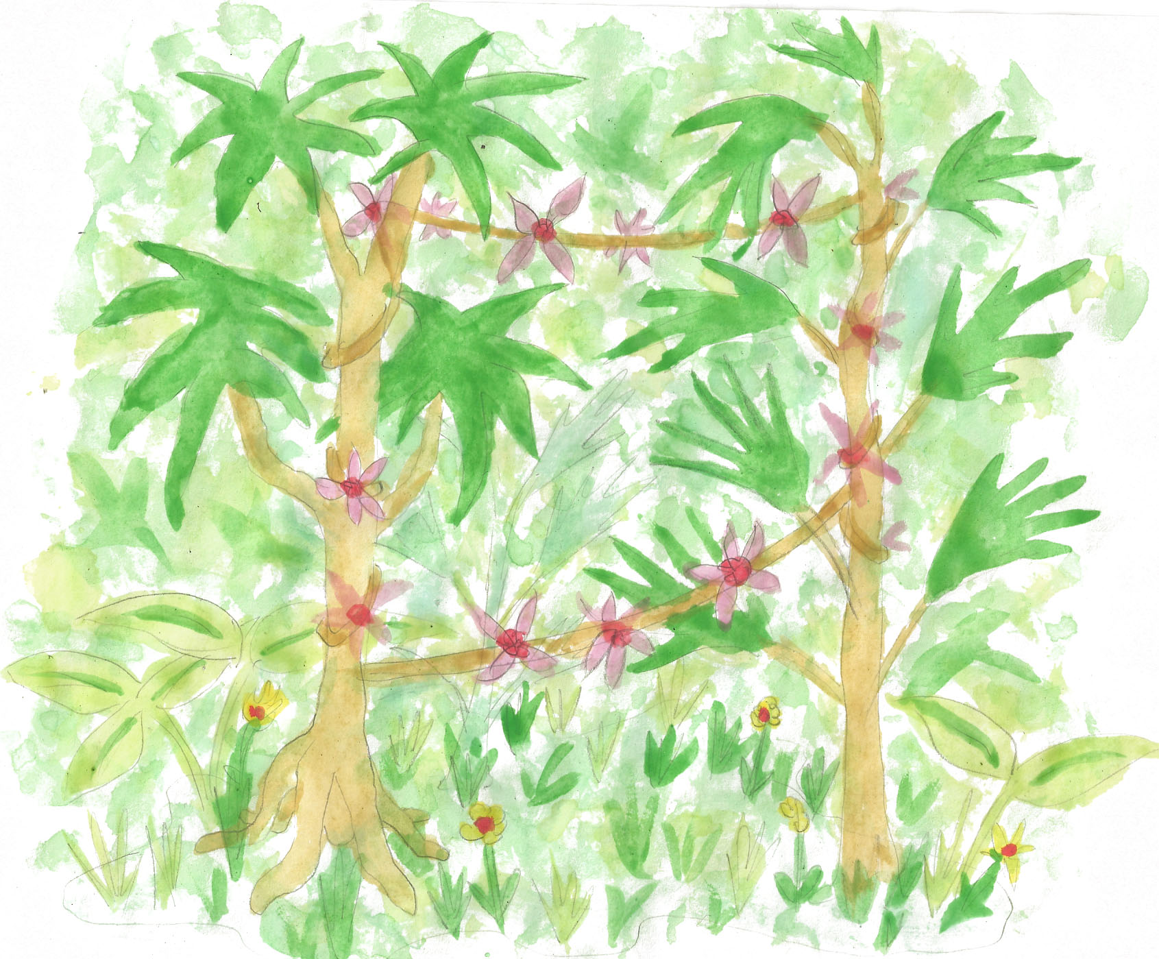
 Instead of the dark ink outlines, I used softer colors that blend in. So far I have only outlined the trees. Oh, and I cleaned up the flowers on the vines. I will do some more work today and share the new version with you later.
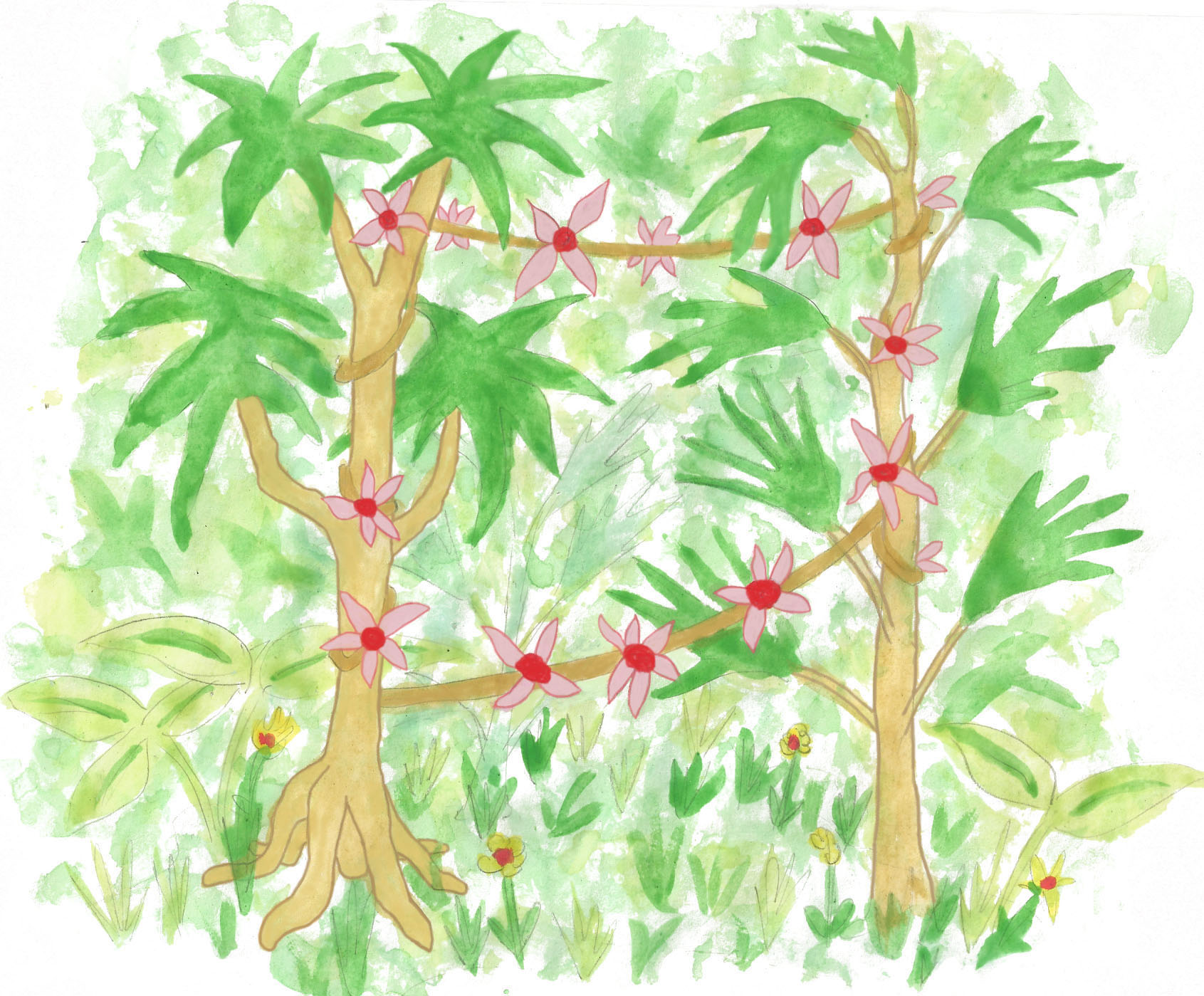
Here is the original so you can compare…
 And here is the dark ink version. Last chance to say if you like this one better. Bear in mind that it isn’t cleaned up yet, so the colors look dull and smudgy…
 Please tell me what you think. And remember that your ideas may end up on the bookshelves of children all over the world.


I like your third version best so far but I think it still needs something, it feels like it’s too one toned or something. Maybe brightening the flowers a little more?
Okay.
I like the dark ink version.
Ahhh… you’re killing me.
What will really mess with you, is wondering if I read Part 4 first, and then commented on Part 3…
I doubt I would notice.
Ha!
(see what I did there?)
Oh, I see it all right… where is my royalty check???
In the mail, of course!
Standard shipping and handling fees apply.
Balance owed to me of $10.99 cents… where’s my check?
sigh
😀
I like the top one too. 🙂 It looks good.
Wait till you see it later.
do i have to wait? 😉
I am still working on it.
can you hurry? lol
It takes a long time… so many button clicks and mouse strokes… zooming in… ahhh…
ha learning curve?
No… it is just a lot of work.
I know I’m odd blogger out, but I like #3.
It sort of pops, doesn’t it? And it might go better with the monkey, which has dark outlines. If I have time I will do a little work on that one… maybe thin the outlines a little. This aint over yet!
I know, I keep checking the updates. You have talent! In addition to your humor. 😉
I will see which way the wind blows.
And aw shucks.
Is that a blush?
maybe
i like the top one, sort of a compromise )
I am going to keep working on it. I still might use the other one for… something…
1st one – looks better now
It is coming along.